

Versatile UI System built to adapt and scale
Versa UI combines true multi-theme architecture with composable components, giving teams the flexibility to shape interfaces without rebuilding them.
Real theming goes beyond colors and fonts
Most design systems call color customization “theming”. Versa UI ships with four complete visual systems built on the same component architecture.



Create new team
Add users and start creating and managing your new team.
Components that go past the basics
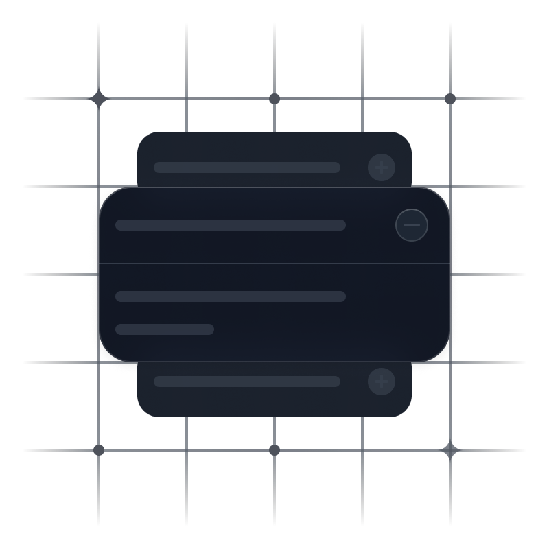
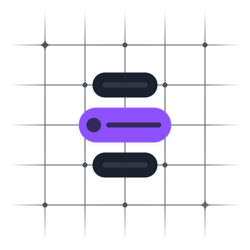
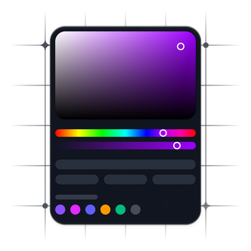
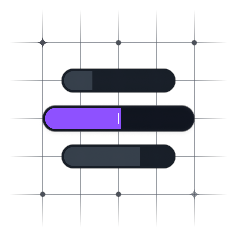
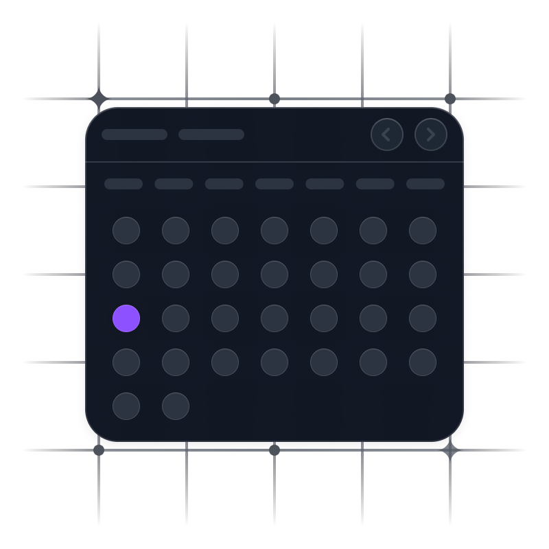
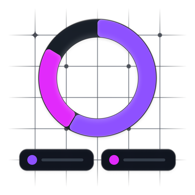
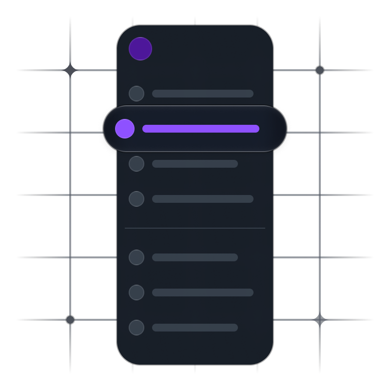
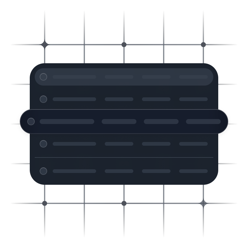
Versa UI covers both core building blocks and complex interface patterns, designed to hold up in real product workflows.
What you design is exactly what ships
Versa UI maintains visual and structural parity between design and code. Components use the same tokens, properties, and configuration.
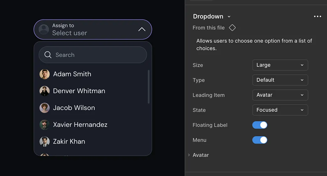


Kickstart with Complete UI Flows
Versa UI includes three production-ready flows. Each flow comes with thoughtfully designed screens, reusable components, and structured layouts.

Built for what actually matters
Versa UI is designed for the messy, real-world details that make systems easier to adopt, scale, and trust across design and code.
Accessible by default
Keyboard navigation, focus states, ARIA support, and interaction states are built in from the start.
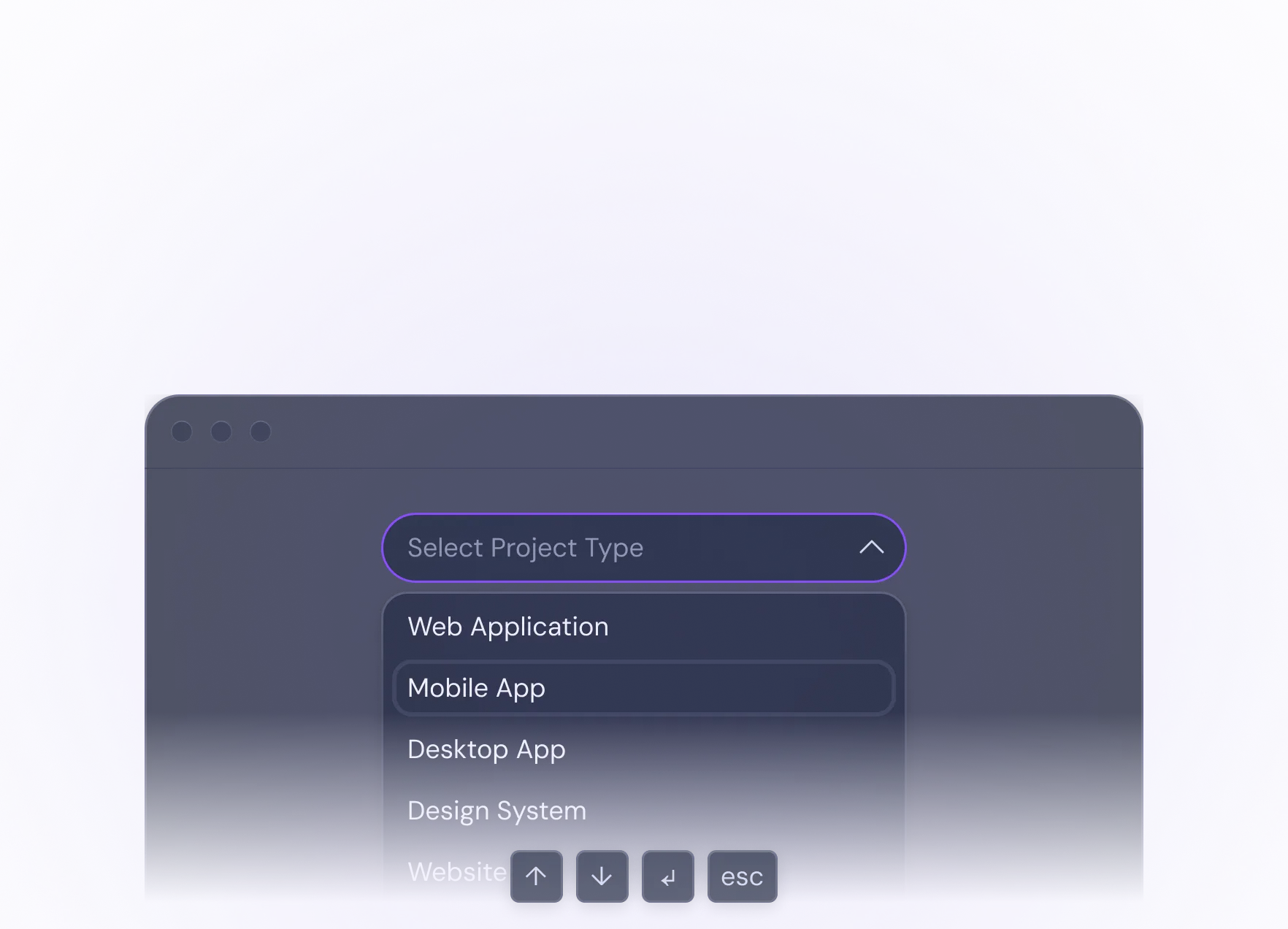
Components built to scale
Primitive building blocks combine into larger patterns, making the system easier to extend without creating fragile one-off components.
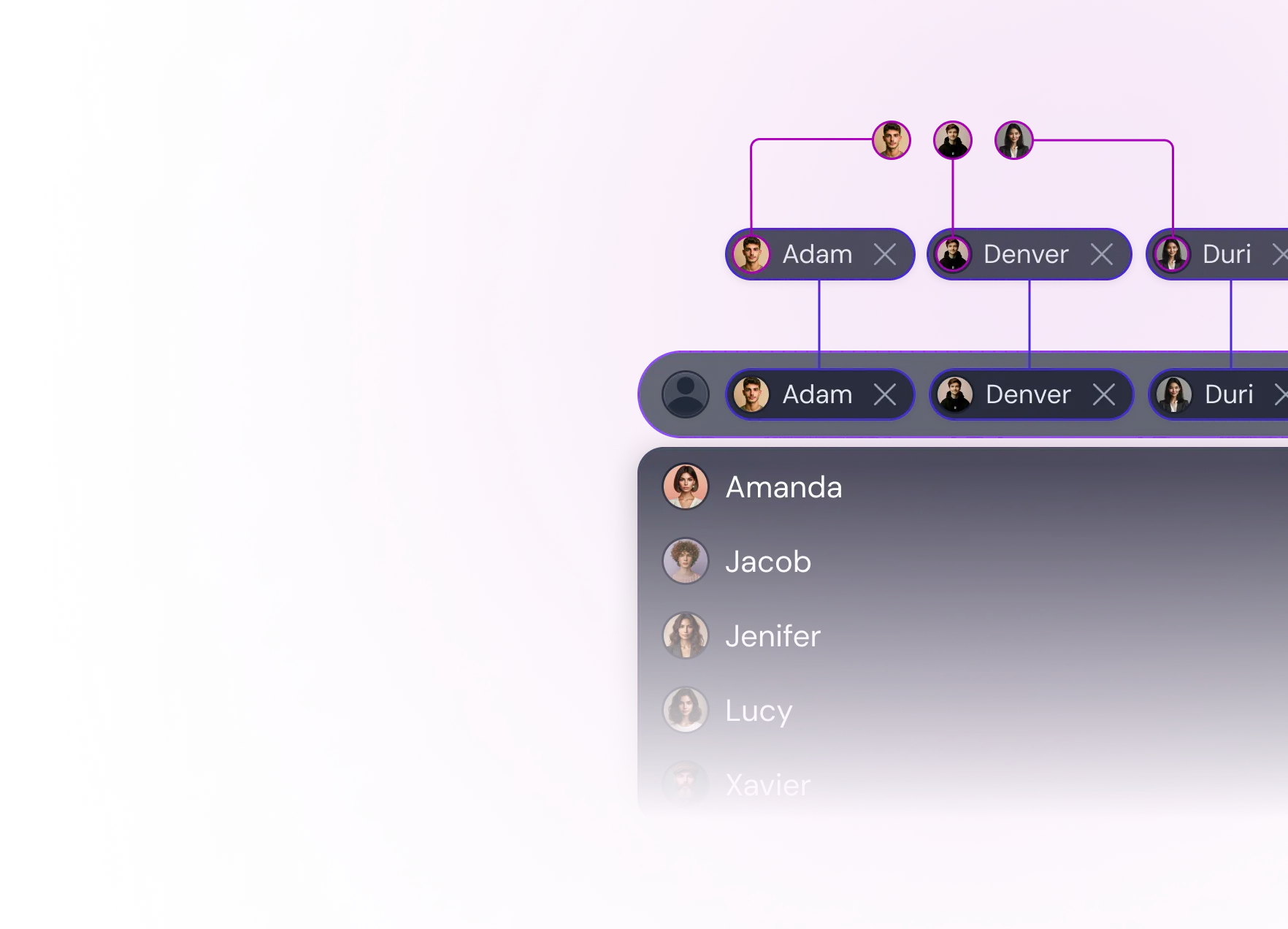
Advanced customization
Beyond themes and modes, components can also be adapted through styling and configuration props.

Powered by shared token system
Typography, spacing, color, effects, and radius are driven by tokens across Figma and React.

Ready for real products
Built with the structure, quality, and flexibility needed for real product teams and production use.

FAQs
Everything you need to know about Versa UI, from access and licensing to themes, components, and compatibility.
General
What makes Versa UI different from other design systems?
Is Versa UI suitable for real production apps?
Can I use Versa UI for commercial projects?
Do I need both Figma and React versions?
How often is Versa UI updated?


Scale Smarter.
Build Faster.
Ship Confidently.
Get access to a theme-flexible, production-grade UI system crafted for creators, designers, and builders.